WPCCU | UX Design
A complete redesign of an LA-based credit union’s web presence, with a focus on human-centered banking through engaging interactions, thoughtful navigation, and colorful visuals.
(opens in new window)
The Challenge
WPCCU’s old website was outdated with a confusing navigation system and little to no mobile experience.
Our team was tasked with designing a new website and providing a custom CMS, meeting our client’s unique needs as a human-centered banking portal.
My Role: Lead designer on a tight-knit team including a front-end developer and full-stack developer. We collaborated with WPCCU’s project manager and other key stakeholders, including their visual designer who provided a general style guide and brand resources from recent marketing collateral.
Design Objective: Provide a modern, refreshed look to reflect WPCCU’s capabilities, future vision, and new brand. The website should be ADA compliant and have a superior mobile experience, intuitive navigation, polished page content, and allow for flexible layouts and extensive use of video.
The Process
Strategy
Discovery
Analysis
Design
Reflection
After articulating WPCCU’s vision and defining the goals and priorities of the project, our research and discovery process included deep-diving with key stakeholders at WPCCU about the current membership experience. We wanted to understand the personas of users visiting the site, are along with the common questions being asked and top actions being taken.
Members needed a clear path to log in to either their regular accounts or investment accounts. The old path was confusing with several calls to action and buried links.
The top actions included searching for home equity lines of credit, auto loans, opening credit cards, checking current rates, and applying for new loans.
The old navigation was overwhelming and cluttered. We wanted to reorganize content into intuitive categories based on the needs of members and perspective members.
The old site lacked an easy way to share community events and latest news. The new site should seem fresh and current, not abandoned.
The Solution
Navigation
Through wireframing and low-fidelity mockups, we developed a new and intuitive site navigation experience.
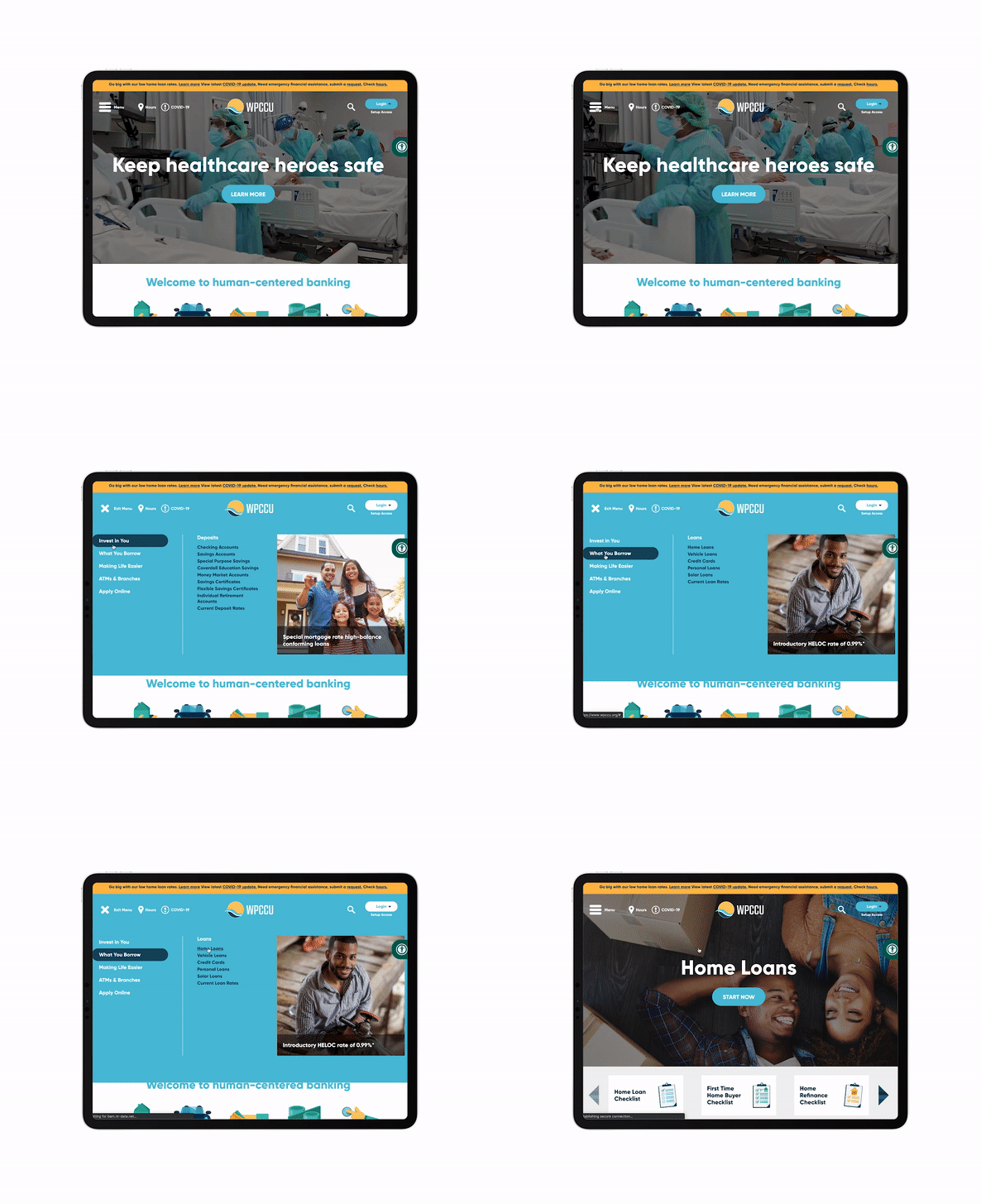
Login, Search, Hours & Locations stay visible in the top.
The mega menu is divided into relatable categories that reflect WPCCU’s focus on “human-centered” banking. The design allows large groups of links to be displayed without overwhelming visitors. This was also a good opportunity to add space for potential ads or other graphics into different categories where desired.
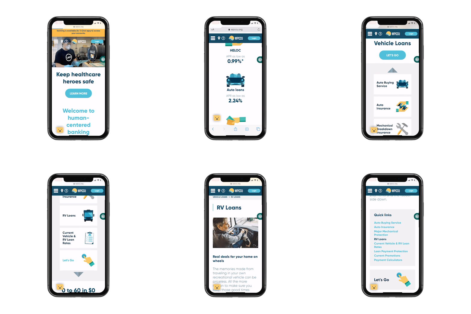
We also added a breadcrumb navigation for deeper levels of content so members could easily understand where they were within the site.
Flexible & Responsive Design
The new site provides a superior mobile experience through a mobile-first mentality throughout the design process.
The flexible grid allows for endless layouts to meet the client’s specific content needs.
Playful, Vibrant, & ADA-Compliant
The new site brings WPCCU’s light-hearted and down-to-earth brand to life through a rich color palette and bold typography.
We provided a higher-contrast toggle for an ADA-compliant experience with carefully selected colors.
Purposeful interactions make navigating the site a pleasant and more intuitive experience.
To further reinforce the brand, we incorporated specific design elements and animated versions of icons WPCCU regularly uses in their marketing collateral.
Results & Reflection
We are proud to win a 2020 Diamond Award for Best Website for Credit Unions in the $500 million to $1 billion range!
The successful launch of WPCCU’s website was dependent on a stellar team effort and regular communication with the WPCCU team throughout the entire process. We went through many UX design iterations with detailed notes and examples for each interactive element.


