


Santa Barbara Wines: The Next Wave | UX Design
A one-page website supporting the Santa Barbara Wines campaign titled, “The Next Wave” to provide information about the Santa Barbara wine region and participating wineries and winemakers
(opens in new window)

The Challenge
Our team was tasked with creating a one-page website for the Santa Barbara Wines portfolio campaign called “The Next Wave”, capturing the spirit of Santa Barbara’s unique location and a balance between the laid-back coastal lifestyle and sophistication and elegance of the region’s wine-tasting community.
The vision according to the creative brief included heavy use of video, rich photography, and plenty of text.
The challenge was to create a way for users to easily navigate through a lot of content in an intuitive way, and design a special winemakers section that required additional layers of navigation and product links.
My Role: Lead designer in charge of wireframing and design, presenting initial concepts and providing finalized high fidelity mockups to our development team, designing accompanying style guide
The Process

Strategy

Discovery

Analysis

Design

Reflection
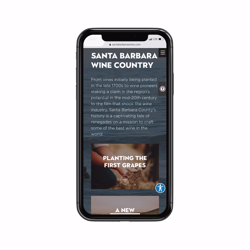
The process for designing this site started with our initial kick-off meeting with the client, discussing the campaign goals and understanding the must-haves and vision for the site. We went over print collateral that had already been developed to get a sense of the campaign look and feel. Visitors to the site will have already been introduced to the campaign via other channels and have some knowledge about wines and are interested in learning more.
The client wanted a magazine-style website and provided a few inspiration sites that utilized parallax scrolling and full-bleed videos. They provided a directory of images and were in process of developing a video montage for a background.
Telling the Story:
I organized the flow of the site so users meander through the history and details of Santa Barbara wine country and culminate with specific details about wines and where to purchase. Based on the brief, visitors were willing to spend more time enjoying content and rich imagery.
At our design check-ins with the client, I presented clickable mobile and desktop prototypes demonstrating navigating the site along with corresponding examples of special interactions. As the content was refined, we created several more iterations, leading to the polished final product! I worked closely with our developers to perfect the Winemakers section which allows you to jump between different winemakers and scroll through each winemaker’s collection of wines.
The Solution
Layers of Navigation
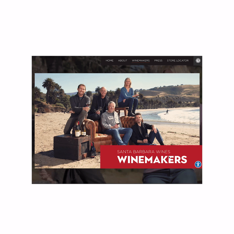
My solution to navigating through a lot of content on a single page involved creating strategic layers of secondary navigation and content. The Winemakers section in particular includes a video, biography, and wines for each individual. I designed a row of shortcuts to each wine maker to allow the user to jump ahead, but if the user chooses to just browse through all winemakers, it is easy to see where you are on the page.
Each winemaker has an an area to expand for more bio details, along with a link to their winery. You can play the video inside the website.
The interactive elements for each winemaker subtly mimic the a rolling wave to reinforce the essence of the campaign.
Expandable Content
Users are able to discover and expand content by clicking or tapping icons for more text, or exploring different modal windows.
It was important to include a generous amount of white space between sections, giving both the design and the user some breathing room and opportunities to take in moments of the calm background video.
Campaign Trailer
Results & Reflection
This project provided a unique challenge of being extremely image-heavy and extremely content-heavy, all within one page! It took several iterations working with the client to fine-tune the copy, and it underscored the importance of clear communication and a solid creative brief so we can work effectively as a team to reach our shared vision.
I provided a detailed style guide alongside this website project, breaking down different elements and their usage, typography, colors, and spacing. With budget and time constraints, the reality is that we’re not always able to provide a style guide for each project. Creating the Santa Barbara Wines guide reinforced what a helpful exercise it is, benefiting both our development team and the client!