Chardonnay [R]evolution | UX Design
A magazine-style website that provides viewers with a deeper, all-access pass to explore the evolution and revolution of Chardonnay.
The Challenge
Despite being one of America’s top-selling wines, Chardonnay has developed a low-brow reputation in certain circles. Our challenge was to create a simple editorial-style website for a newly launched campaign promoting the revolution of Chardonnay wines, featuring collections from several Jackson Family wineries.
My Role: Lead designer working alongside our development team
Design Objectives:
Create a similar aesthetic to a Wine Spectator advertorial provided by the client: Clean, modern, white background, with mostly watercolor sketches in lieu of photographs.
Develop an intuitive user experience for an interactive timeline with multiple layers of categorized content.
The Process
Strategy
Discovery
Analysis
Design
Reflection
In our project kickoff meeting, we went over the creative brief provided by the client to get an understanding of their vision, the target audience, and the types of content to be included. The goal was to create a magazine-style editorial website to learn more about Chardonnay, however the specific content to be included had not yet been written. As a team, we developed a general content outline which included two complex features: an interactive map and a timeline.
The design process included gathering imagery that fit the vision of the campaign and proposed content. The final illustrations would be created by an illustrator after the content was finalized.
We presented wireframes and an interactive prototype to demonstrate how a user might navigate through different sections. As the client refined the content, we were able to fine-tune the layout options.
The Solution
Interactive Timeline
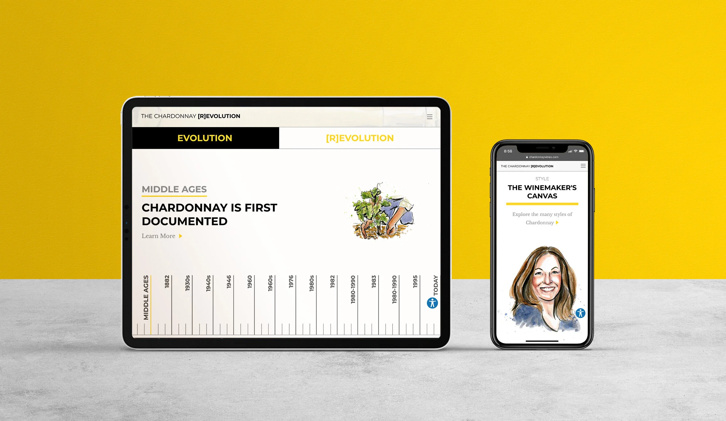
The timeline takes the user through the history of chardonnay, broken into two date ranges representing the evolution and revolution of chardonnay. For each key date, we created a feature with an image and summary, and link to a modal window with more information. Browse by flipping through features or jumping to specific dates on the fixed timeline at the bottom. The layers of navigation allow the user to get the information they want quickly and easily.
Elegant & Endless Layout Possibilities
We created several pages of different layout options based on the content outline that developed during the project. The Style page in particular contains a significant amount of information, so we created a fixed block of tabs to allow users to jump to different sections while making it clear to the user where they are, if they want to jump ahead or go back to a different section.
Simplified Map
We presented two concepts with corresponding low-fidelity mockups for a regional map. An interactive version would zoom in and out of different highlighted areas and show relevant content as you navigate the map. The complex interactions were doable but would take a bit longer to build.
As the client’s vision and content for the map evolved, we developed a simplified solution with several static maps that still achieved a sense of interactivity and were easy to explore.
Results & Reflection
The greatest challenge of this project is that the client only had a basic outline of content ideas, which evolved as we developed the website. Because of this, the wireframing and design iterations provided them ideas on what was possible, and the client developed their copy and illustrations based on the different options we provided. The process became very collaborative!


